

Zeit Time Travel
Zeit is time travel tourism company and the first of its kind on the market. To get the public excited about this new form of travel, I worked to create an intuitive and informative website that highlights the innovative time travel technology and once-in-a-lifetime trip booking possibilities. With a focus on a seamless user experience and eye-catching user interface, Zeit has made time travel possible for the first time in history.
Project Role:
UI/UX Designer and UX Researcher
Design Process

1. The Problem
Zeit wants to make time travel tourism accessible for the first time in history. In order to do that I worked to define what the new technology has to offer customers, discover who the direct and indirect competitors are, and gain insight into creating an intuitive and enjoyable experience for potential users.
2. Research Goals
The main research goal was to gain insight into what makes an enjoyable travel booking experience to create an intuitive website that differentiates itself from competitors. Some of the research objectives include:
Understand what would motivate a user to try this new technology; what excites them about it; and what they’re potentially hesitant about.
Understand user priorities when booking travel; what makes them prefer one service over another; and what some of the potential pain points are?
Better understand the competitive landscape.
3. Research
In order to contextualize the competitive landscape, I conducted an analysis of various direct competitors in the space travel industry. Along with that, I interviewed a variety of participants to gain insight into what users want, what they need, and potential frustrations when booking travel.
Competitive Analysis
User Interviews
Key insights:
Between 5 participants of varying ages, occupations, and lifestyles, 100% of them expressed the importance of finding the best and cheapest deals while planning their travel. One participant expressed hesitancy when using booking sites as they prefer going straight to an airline or hotel site to plan their trip. The other 4 participants had a strong preference for deal comparison sites, as they allowed them to see all of their travel and hotel options in one place. 60% of the participants expressed wanting their travel to be as customizable as possible, while the other 40% seemed open to a more curated travel experience. Overall, all of the participants had different travel goals and interests, but all expressed the importance of ensuring their own personal safety and wellbeing while traveling to new places.
Goals Analysis
4. Information Architecture
Site Map
By taking the competitive analysis and user interview findings into consideration, I began sketching how the site may be laid out. I started by creating a site map of some initial pages the site would contain. Following the site map, I created a task flow for how a user might get from the homepage to the product check out page.
Task Flow
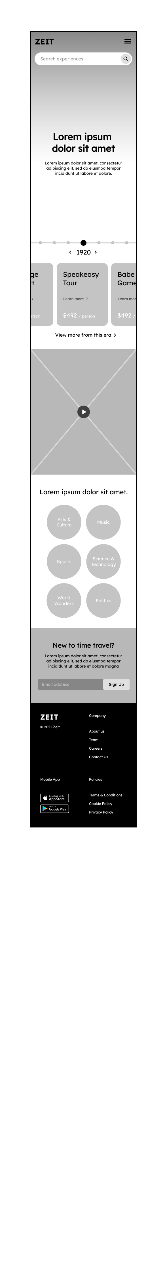
5. UI Design
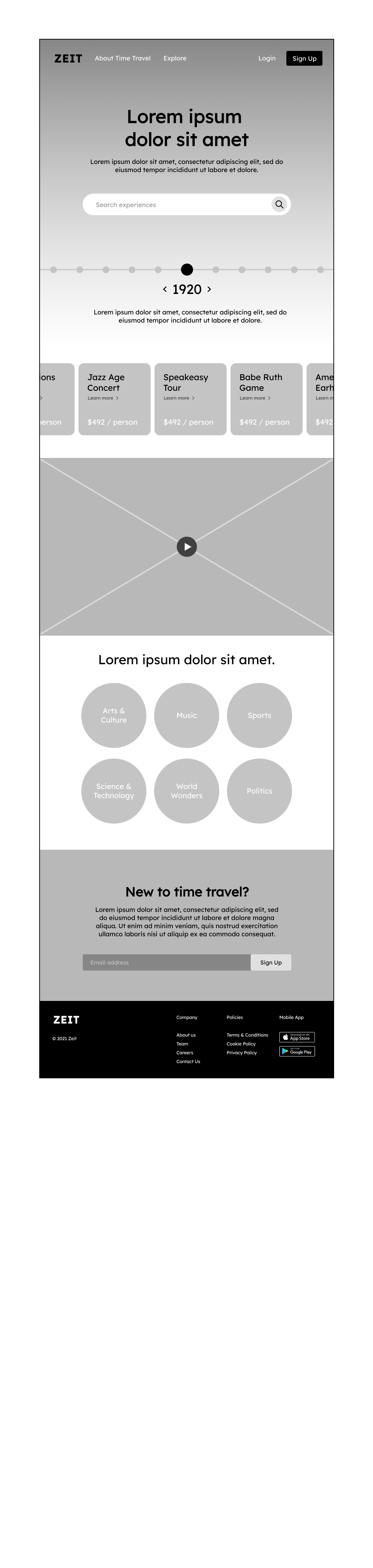
Once the architecture of the site was created, I began designing the site layout, logo, and UI branding. Keeping the modern and high-tech nature of the brand in mind, I created dynamic responsive wireframes, and leaned into a bright/futuristic aesthetic.
Initial Sketches
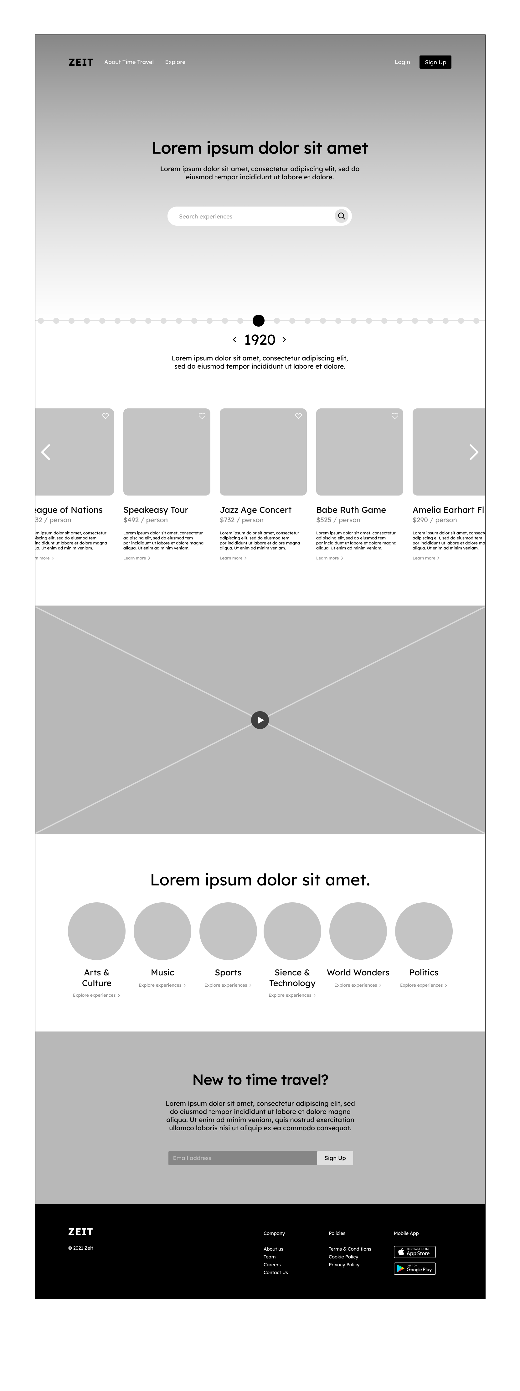
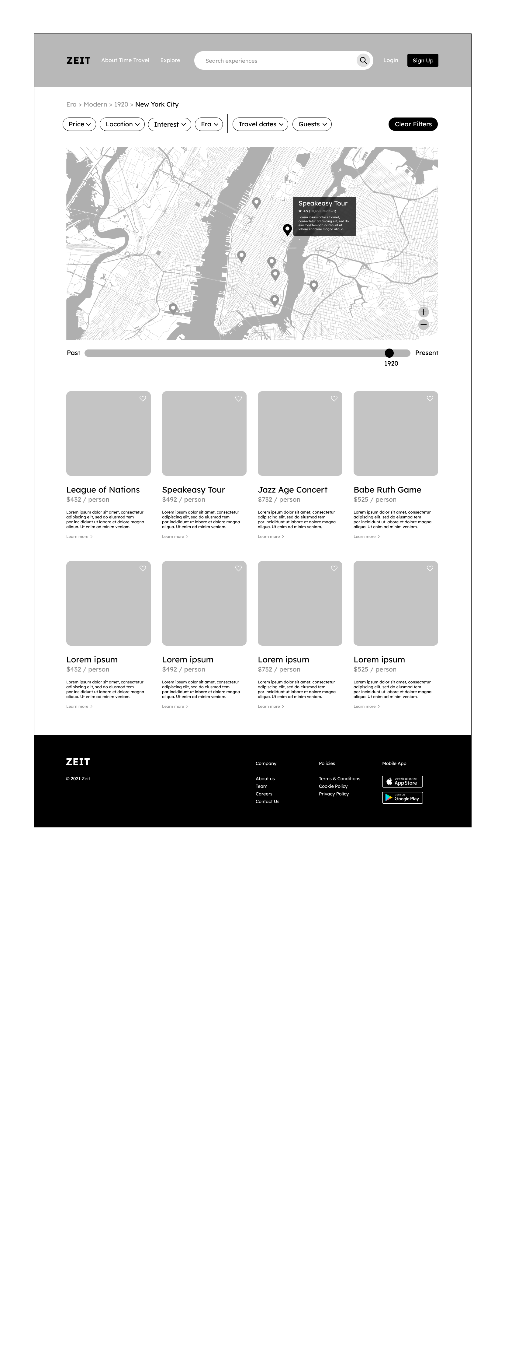
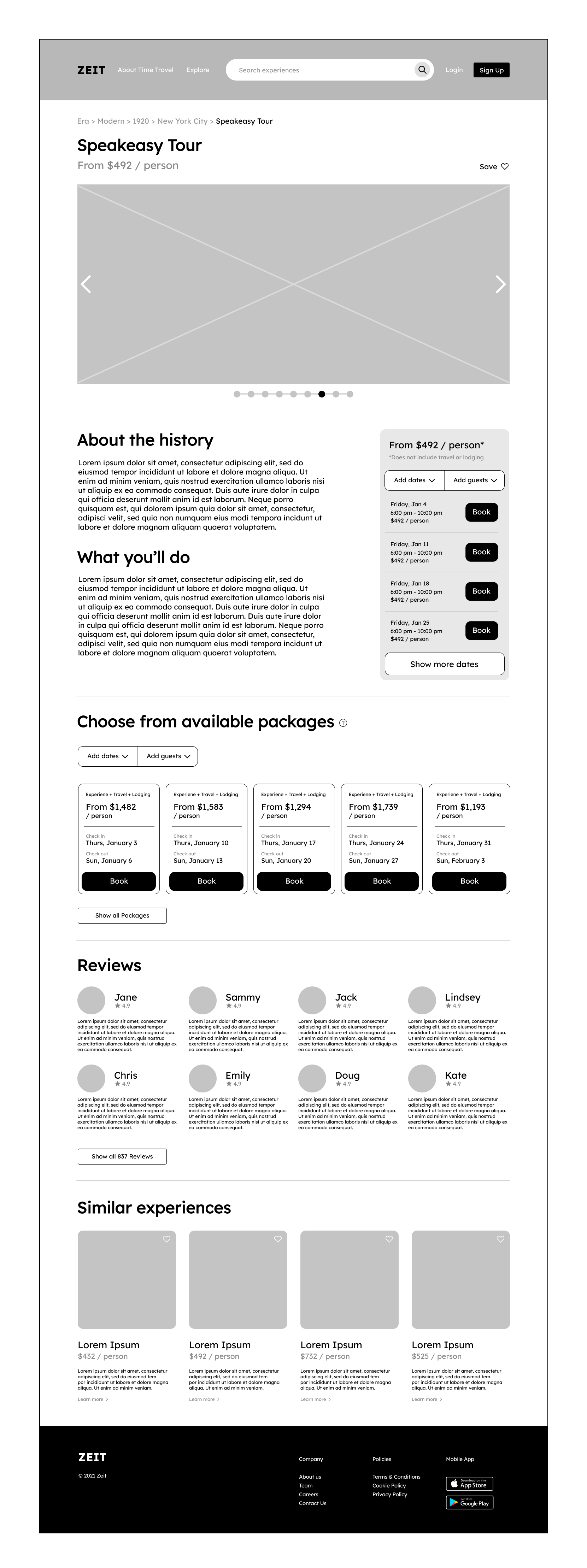
Responsive Wireframes
Logo Design
UI Kit
6. Testing
After designing the brand and UI kit, I brought it all together by creating a responsive prototype. To test the site, I chose 4 participants to complete 3 specific tasks. I observed the ease at which they were able to complete the tasks, any personal reactions, and potential pain points they had. The tasks included:
Task 1:
Book a 1920s speakeasy tour for 2 guests
Task 2:
Navigate to the Jazz Age concert detail page
Task 3:
Add the 1939 Queens World's Fair to your favorites
Prototype
Affinity Map
Iterations
From the original version to the revised, I added an “Explore all” button next to the search bar for easier browsing. I also added visible time periods to the home page slider bar to make it obvious that users can explore different eras.
In the original version, many test participants seemed confused by what a “premium package” had to offer, so I revised the design of the product detail page to list out what travel amenities were included in “standard” and “premium” packages.
Another common bit of participant feedback was about the filtering menus. In the revised version, I made it more obvious what category each search page was being filtered by.
Finally, I added more information to the confirmation page about the users’ chosen trip, and gave them the option to add it to their Google calendar in hopes of keeping them engaged.
Conclusion
Throughout this project I’ve learned to better understand the power of user feedback. Being able to observe users as they navigate the site gave me useful information about what was working and what wasn’t. My overall takeaway is that real-life feedback is invaluable at all stages of the design process from ideation until implementation.