

Ridgewood Vinyl
Ridgewood Vinyl is a small record shop located in the heart of Ridgewood, Queens. With the help of the owners, I’ve created a responsive website to help attract new business, gain brand recognition, and allow customers to easily communicate with the shop for merchandise inquiries and sales.
Role: UX Designer & Researcher
Design Process
1. The Problem
Ridgewood Vinyl has historically relied on local foot traffic for new customers and general brand exposure. Because the shop has a small staff and ever changing inventory, they have found it hard to stay on top of their online presence. In order to reach a larger audience and wider customer base, they’re looking to create a low lift landing page that would allow for them to showcase the shop and it’s wide variety of music.
2. Research Goals
With this research, I wanted to gain insight into how people buy and sell records, how people find record stores they like, and how customers utilize the internet when looking for new music. I also looked to identify any notable successes or pain points customers had in their process.
3. Research
I began my research by analyzing various record shops that have an online presence to better understand the competitive landscape. From there I conducted user interviews with a variety of participants who frequently shop at record stores. I then synthesized all of my findings and created a provisional persona to use as a reference point during the design phase.
Competitive Analysis
User Interviews
Key take aways:
During the user interviews, many of the participants expressed their love of being able to physically explore new music in a time when a lot of music is consumed online. Some expressed that online music shopping is easier and more intentional but going into a physical record shop is more of a fun and emotional experience. Others expressed that knowing someone at the shop or having good communication has a large impact on which shop they choose. And most participants mentioned that location and proximity to the shop is very important.
Goals Analysis
Provisional Persona
4. Information Architecture
By taking the competitive analysis and user interview findings into consideration, I began sketching how the landing page may be laid out. I started by creating a site map of the features and then created a chart of the user’s journey from looking for a local record shop to buying records.
Site Map
User Flow
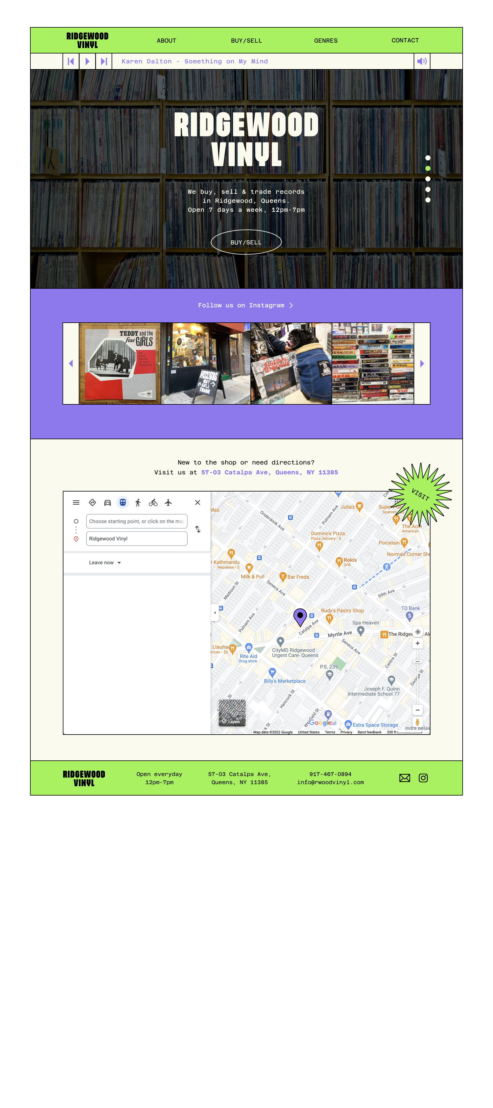
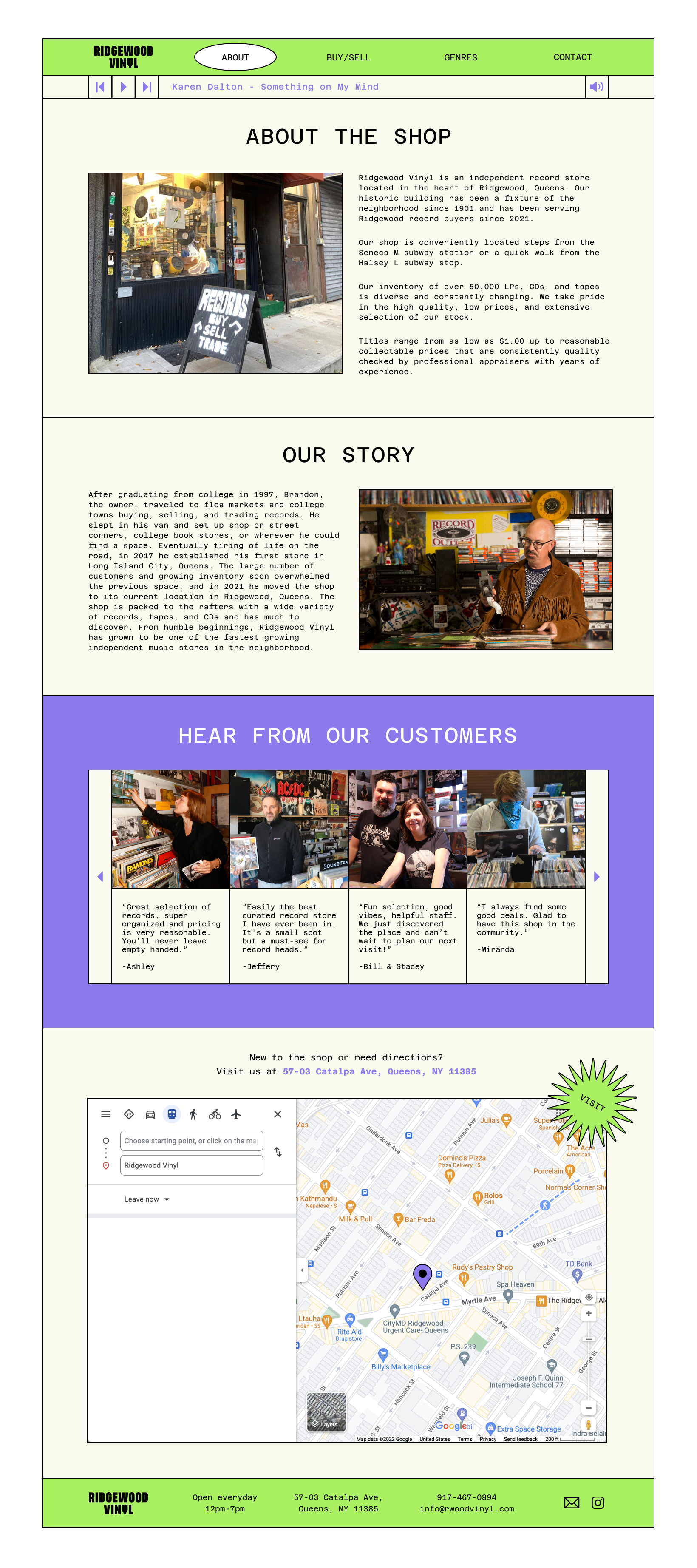
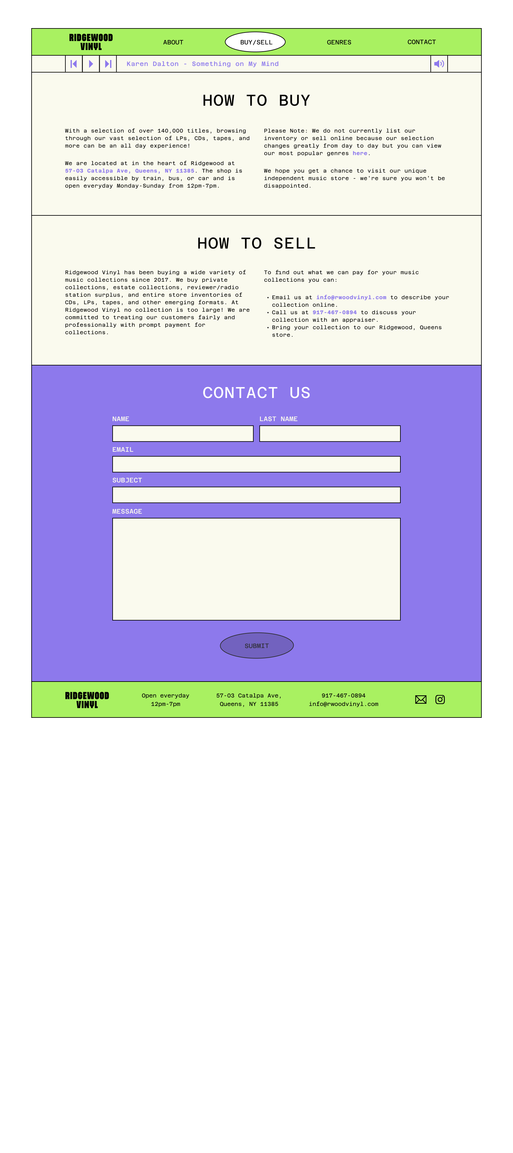
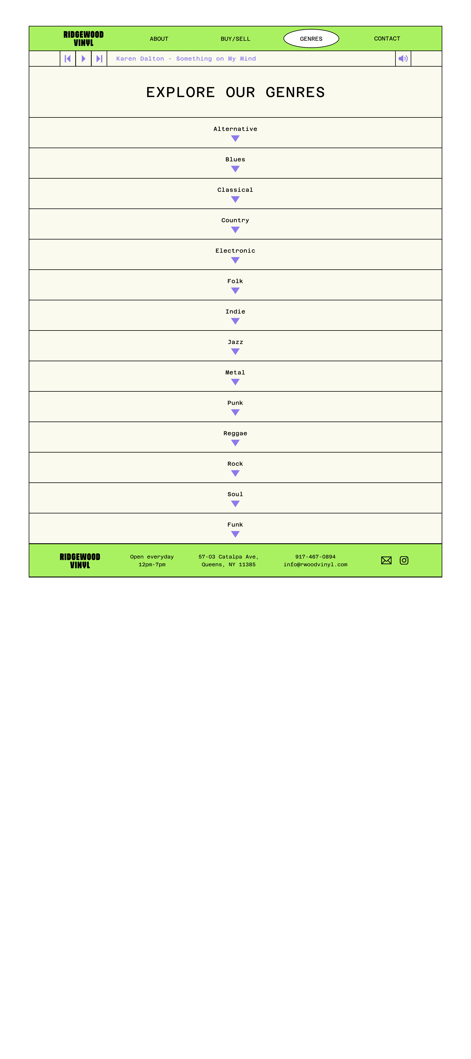
5. Design
Once the the general flows were created, I began sketching how the various pages may start to come to life.
From there I worked with the shop owners to help digitize their logo and create a full UI kit with the shop’s general look and feel in mind.
Once the branding was settled, I designed high fidelity wireframes based on the initial sketches and created a limited prototype to utilize for the next round of user testing.
Initial Sketches
UI Kit
Wireframes
6. Testing
Following the designs, I chose 5 participants to complete 4 specific tasks. I observed the ease at which they were able to complete the tasks, any personal reactions, and potential pain points they had. The tasks included:
Task 1: Learn about the shop and decide if this is a place you would like to visit.
Task 2: Browse the site to see what types of music the shop has to offer.
Task 3: Contact the shop to get your record collection appraised.
Task 4: Find directions and plan your visit.
Prototype
Affinity Map
Priority Matrix
Iterations
Most of the feedback I received from the usability test was around the content of the site. A common question I received was if there was a way to buy or sell records online through the landing page. Because this type of e-commerce integration would have been too much of a heavy lift for the owners, I was able to switch out some of the language to help clarify.
One participant mentioned wanting to see more social media iconography for quicker visual recognition, so I added the Instagram logo to accompany the link to their page.
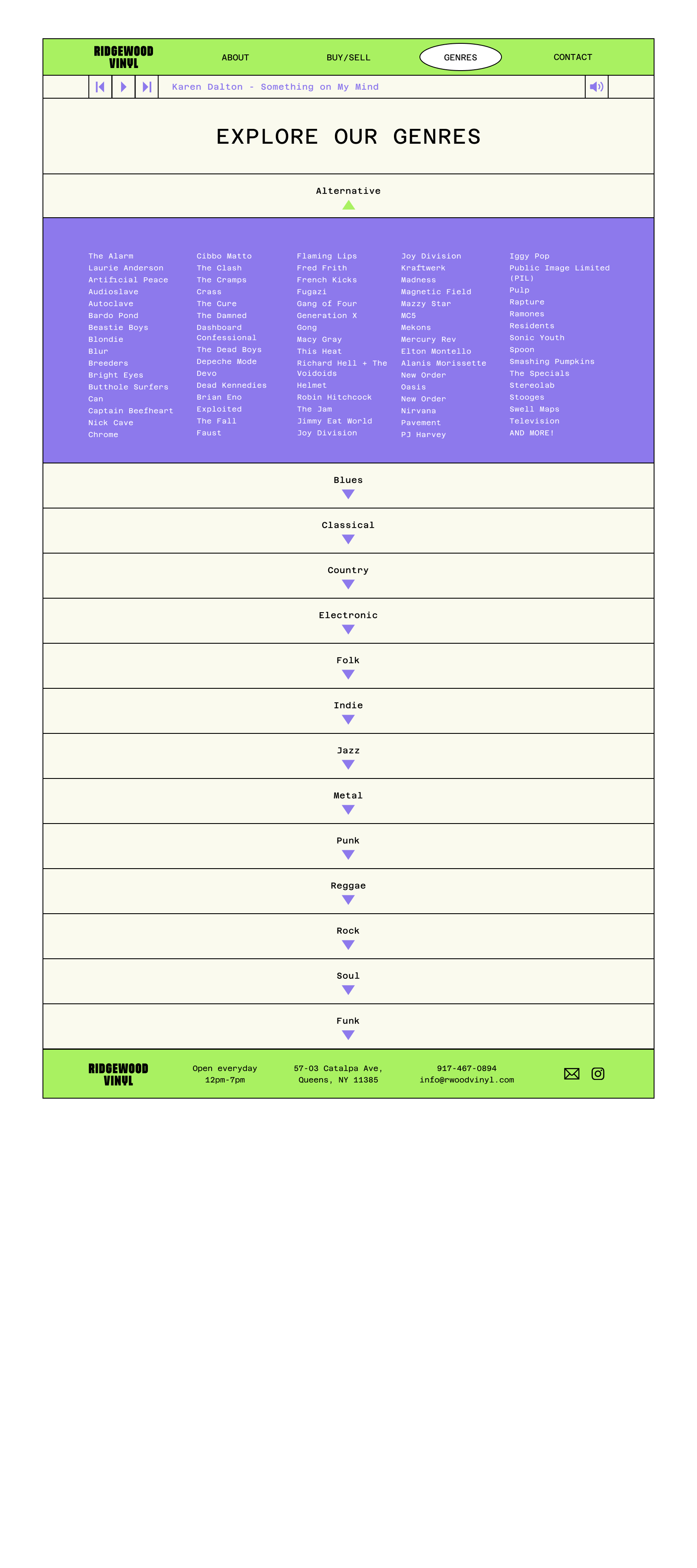
Some participants seemed confused about the Genre section so to help clarify, I switched some of the language and added an extra note to specify that page’s function.
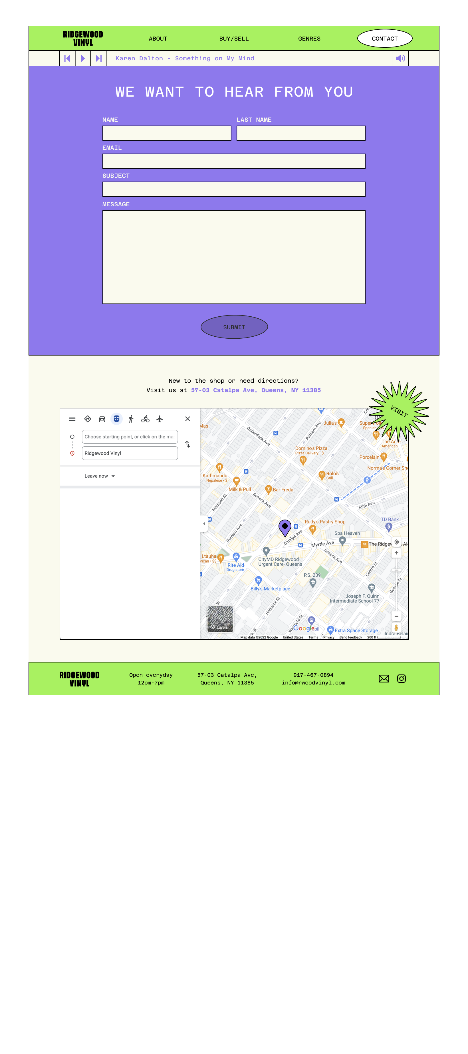
Lastly, I added a “Visit” page on the navigation bar for quicker access, and added the shop’s address and contact information closer to the top of each page for extra clarity.
Conclusion
Working with a small business client was a great learning opportunity. This project allowed me many creative freedoms, while also keeping in mind various client needs and limitations. Learning to adapt and navigate design based on real-life business and user needs is an invaluable skill.