

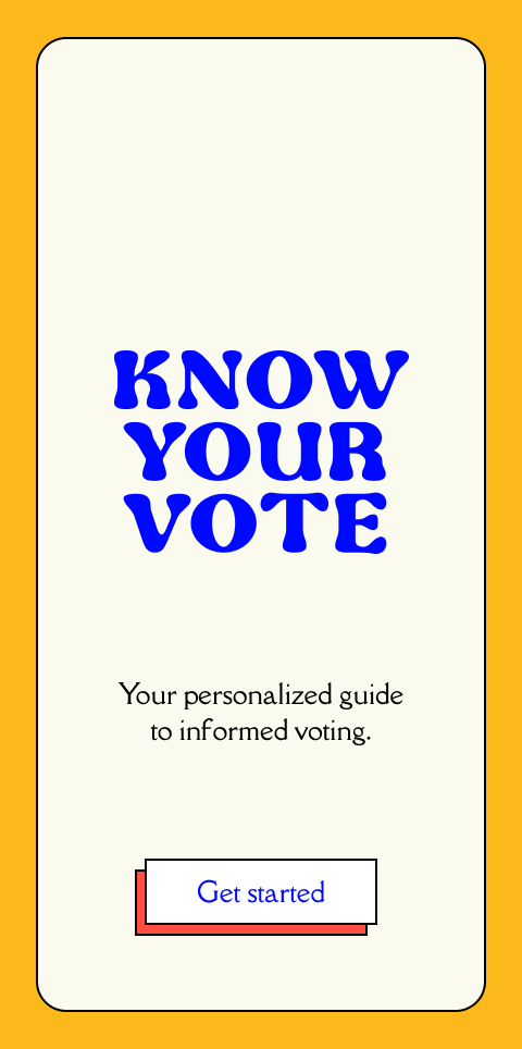
Know Your Vote App
Know Your Vote is a political education and electoral engagement app focused on making voting more accessible for all Americans. With the intent of building a more inclusive and intuitive electoral process, I’ve created an app that helps voters stay informed about the policies and issues that matter most to them.
Role: Product creator, UX Designer & Researcher
Design Process

1. The Problem
Politics are often understood to be confusing, daunting, ineffective, or even highly divisive or taboo. Because of this, many Americans believe that there is a high bar to entry when getting involved with politics, or are turned off to the process all together. This has historically led to skewed electoral results and widespread civic underrepresentation.
2. Research Goals
For this initiative, I wanted to gain a better sense of the role politics, voting, and community engagement plays in peoples’ lives. My main research goal was to understand how people consume political information and make informed voting decisions. To do this, I worked to identify their overall goals, motivations, and frustrations around news consumption and political engagement.
3. Research
I began my research by analyzing various voting initiative sites to better understand the competitive landscape. From there I conducted user interviews with participants of varying demographics and political backgrounds. I then synthesized all of my findings and established a provisional persona to use as a reference point during the design phase.
Benchmark Analysis
User Research
Key take aways:
During the user interviews, many of the participants believed that politics can be confusing or daunting but still feel a civic obligation to vote in every election. 75% of the participants expressed feeling overwhelmed or frustrated by the process of learning about candidates, and sometimes settle for the person their friends or family members are voting for. 100% of the participants believed that local elections make more of an impact on their life, but it is harder to find reliable information about them. All of the participants also expressed that information around national politics are more accessible, but those elections tend to make less of an impact on their lives. Overall, the participants believe that easily accessible political education is an integral part of informed voting and maintaining a healthy democracy.
Goals Analysis
Provisional Persona
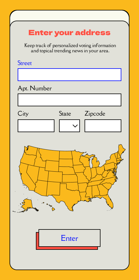
4. Information Architecture
By taking the competitive analysis and user interview findings into consideration, I began sketching how the product may be laid out. I started by creating a site map of the product features and then laid out user’s journey from learning about a local election to making an informed voting plan through the app.
Sitemap
User Flow
5. Design
Once the the general flows were created, I began sketching how the various product pages may start to come to life.
From there I designed the app’s logo, branding, and curated all of the elements to create a UI kit.
Taking the branding into consideration, I designed high fidelity wireframes based on the initial sketches and created a limited prototype to utilize for the next round of user testing.
Sketches
UI Kit
Wireframes
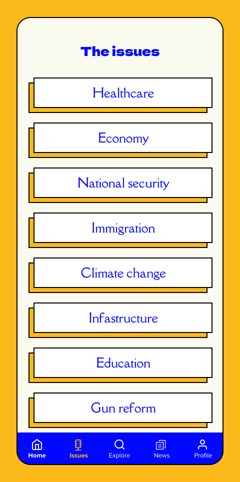
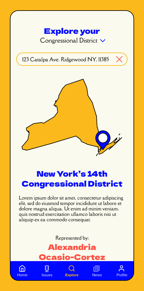
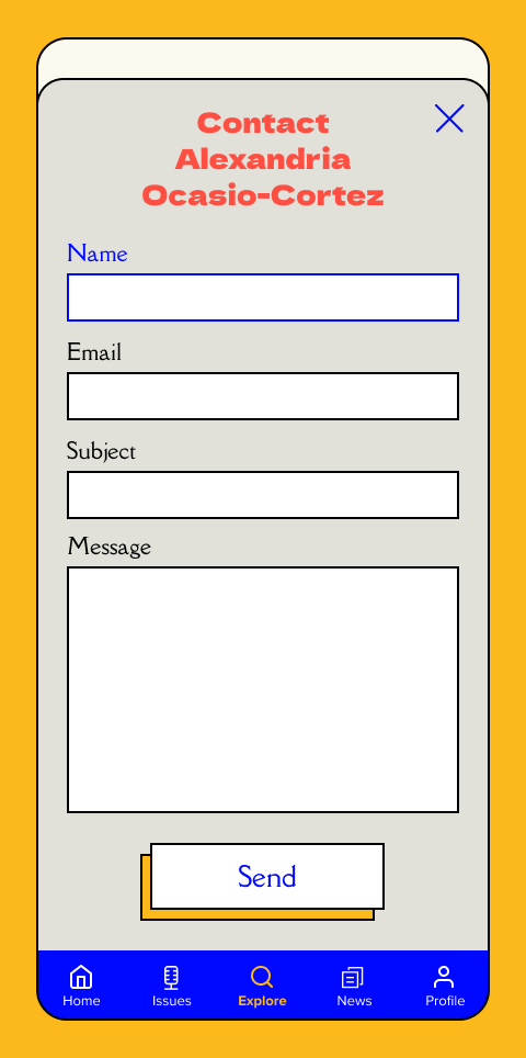
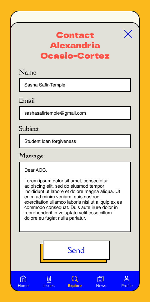
Prototype
6. Testing
Following the designs, I chose 4 participants to test the initial prototype. My objectives were to observe the overall usability and navigation of the app, test the ease in which they can sign in and create an account, test any accessibility issues, discover any additional features that may be helpful, observe any areas of hesitation, confusion, or difficulty.
Test Subject
High fidelity prototype showcasing various flows
Participants
4 adults with varying levels of political involvement
Ages ranging from 31-63
All familiar with social media
Task 1: Sign into the app and find information about your upcoming election’s mayoral candidates
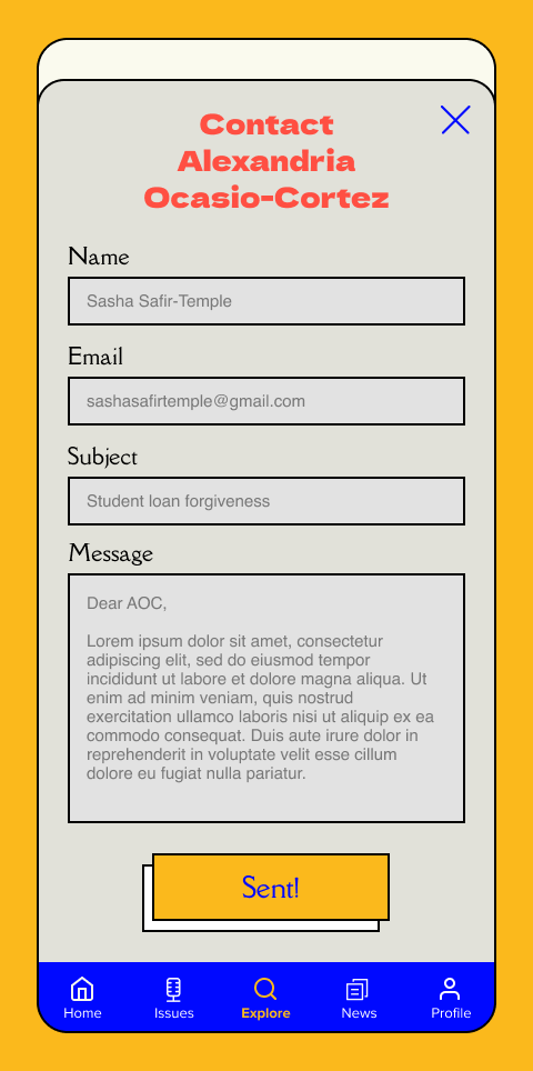
Task 2: Search for your congressional district’s representative and sent them an email
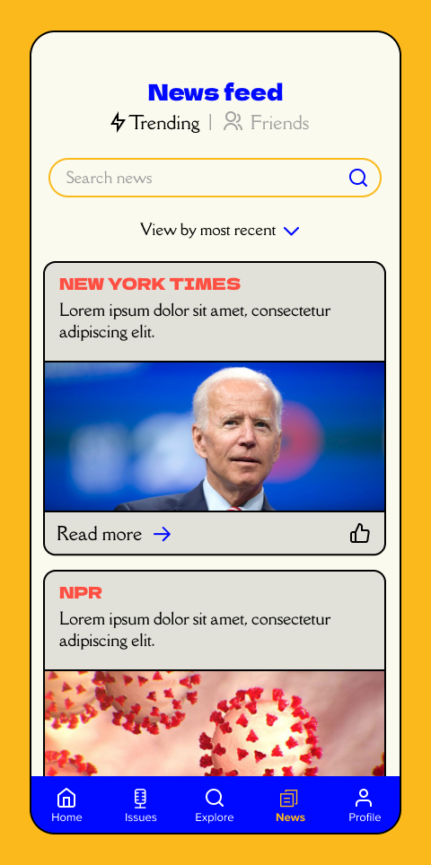
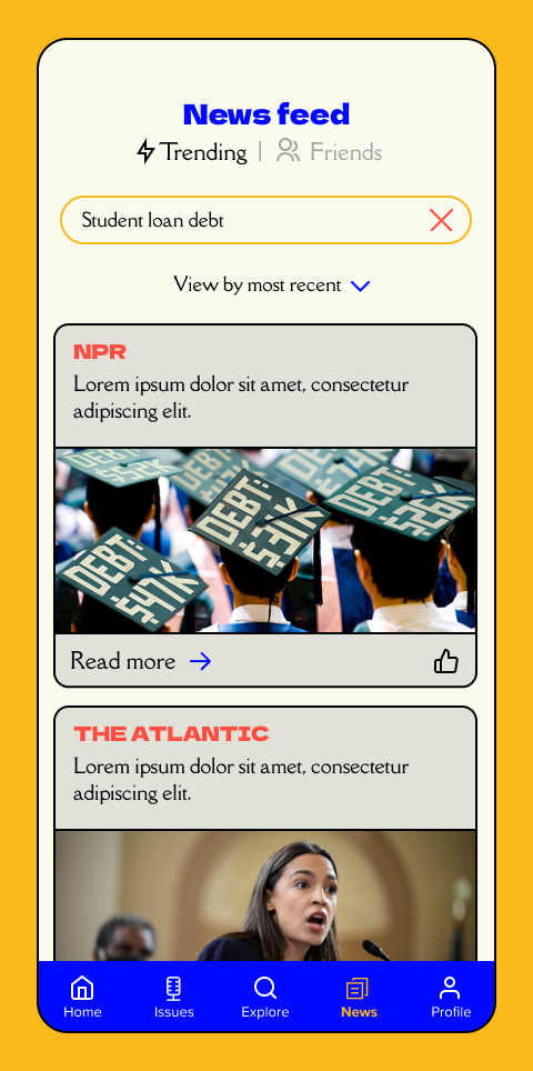
Task 3: Find your friends’ news feed
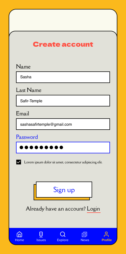
Task 4: Create an account and sign into your profile
Affinity Map
Priority Matrix
Iterations
One of the main issues I observed during usability testing was the hesitation to find the “done” button. To help alleviate confusion, I changed the color of the button to signal that the user has filled in the correct fields and can continue to the next screen.
The second bit of feedback I received was around the accessibility of the bottom navigation tabs. Some users thought that the yellow icons were hard to see and wouldn’t be noticeable to people with visual impairments. To fix this issue, I created more contrast by making the button background yellow and the icon black. This helped with overall visibility and alleviates confusion around what page a user is on.
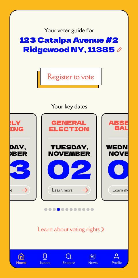
Another thing I observed while testing was some confusion around the homepage Key Date card scroll. To make this function a bit more obvious, I added left and right navigation arrows to indicate that there is more content to be seen if the user scrolls left or right.
Another user suggestion was to add Share buttons to the articles so users would have the ability to send topical news articles to friends who may or may not have the app.
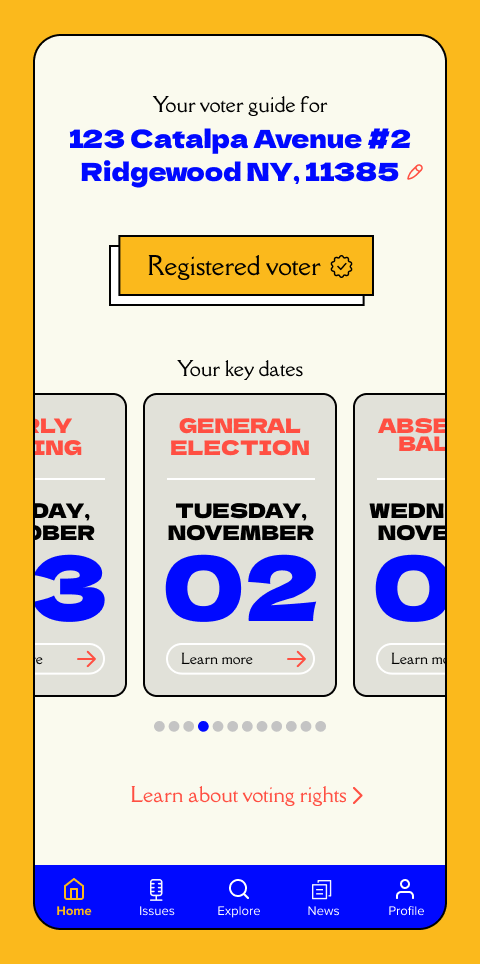
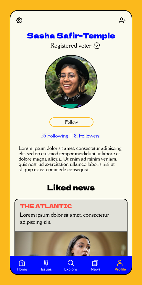
Lastly, I changed the wording from the “Registered Voter” button to specify what party the specific user is registered with. This helps give the user some context into the specific content they’ll have access to within the app.
Conclusion
During this process I’ve learned that it is easy to get overly ambitious or lost in the details when designing an MVP. There is a lot that goes into the creation of a new product and I’ve realized that it is best to keep things simple at first and continue to test and validate. All to say, I am pleased with how the first iteration of the app came together and am looking forward to continually updating and building upon the product.